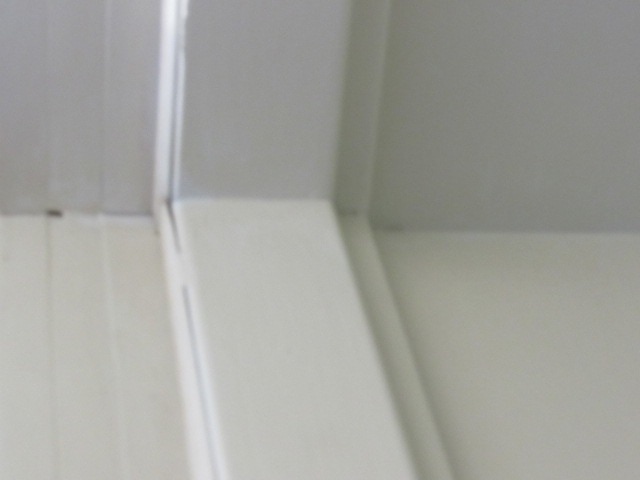
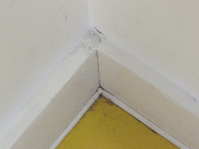
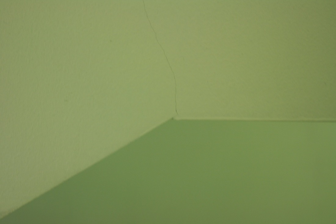
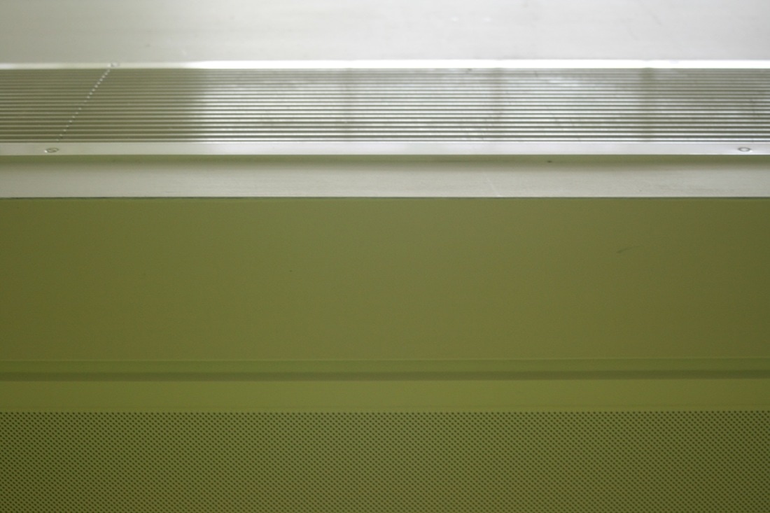
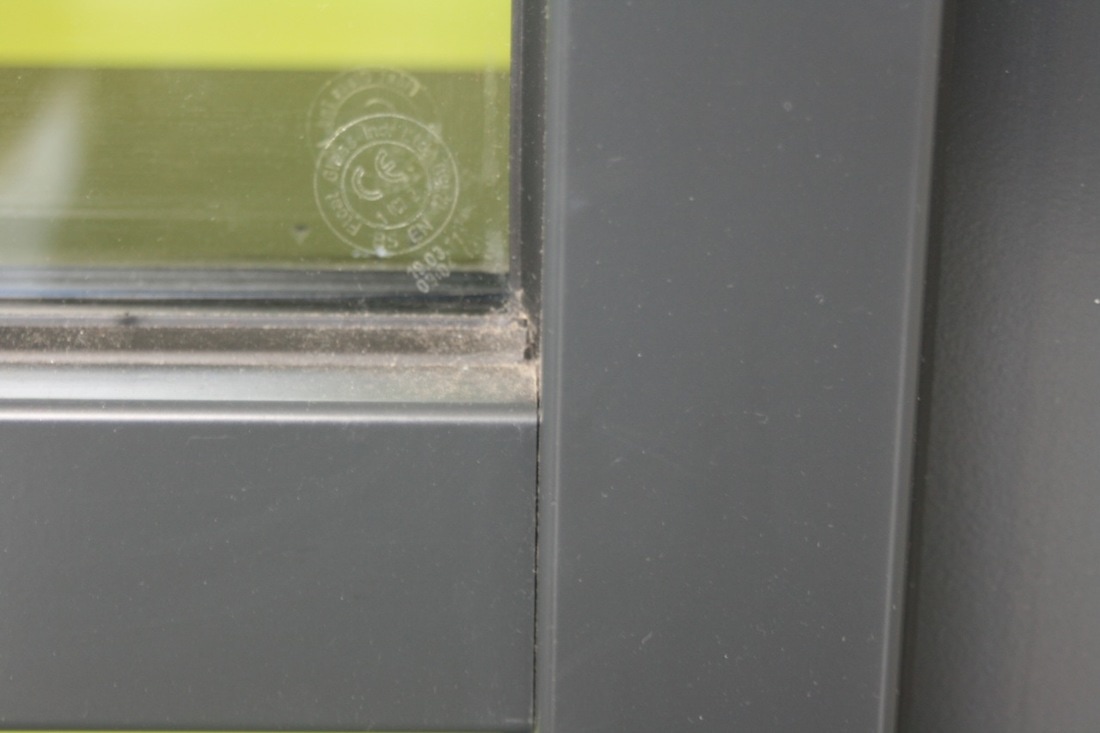
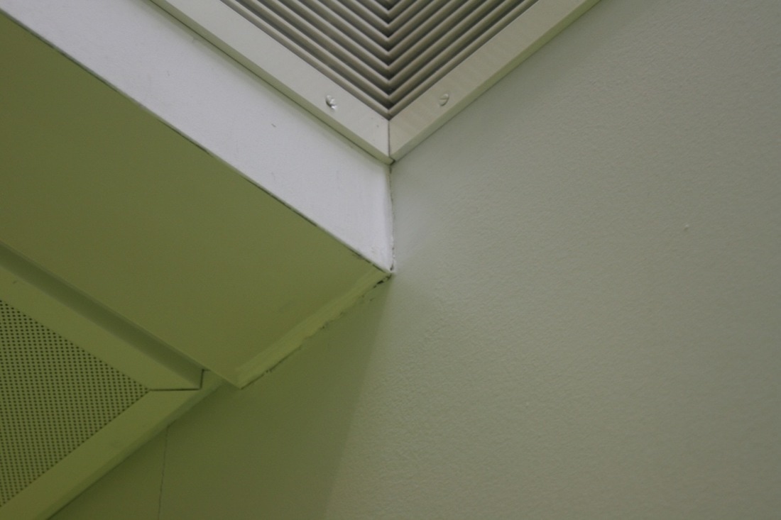
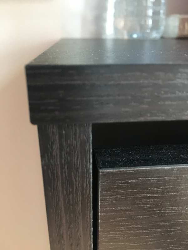
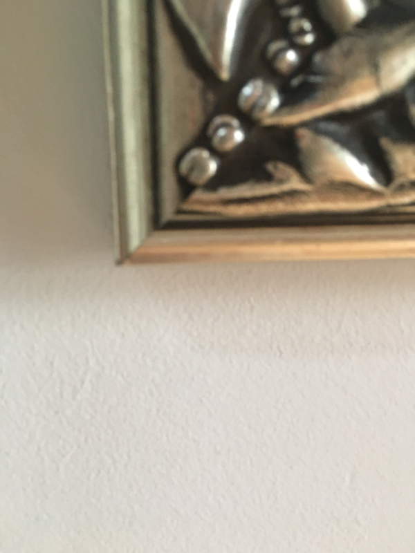
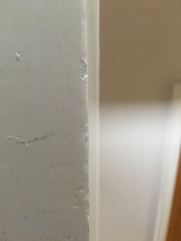
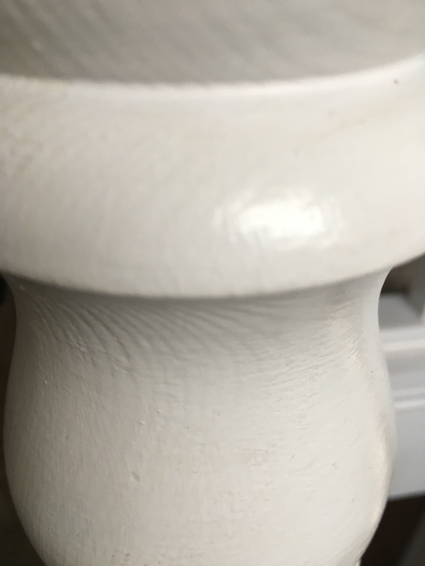
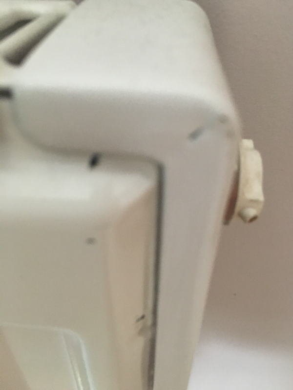
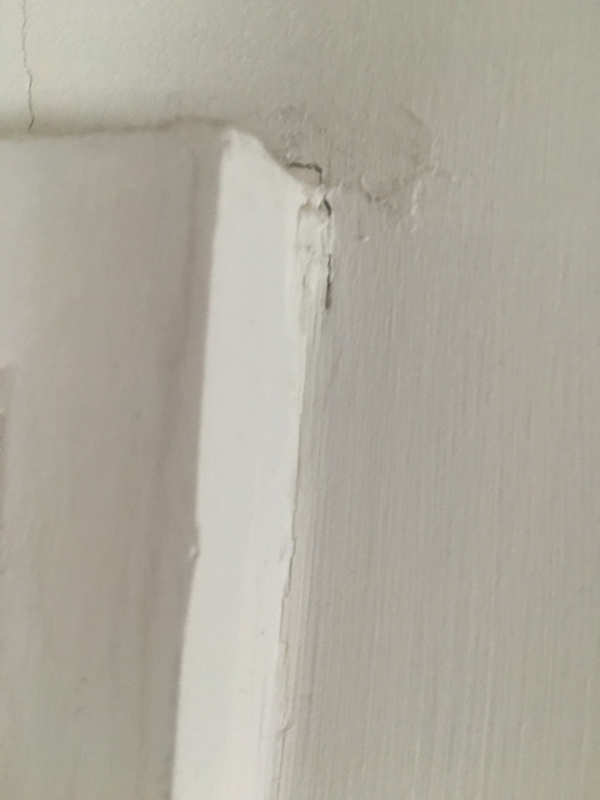
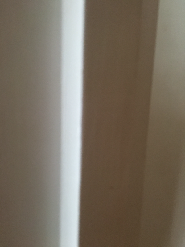
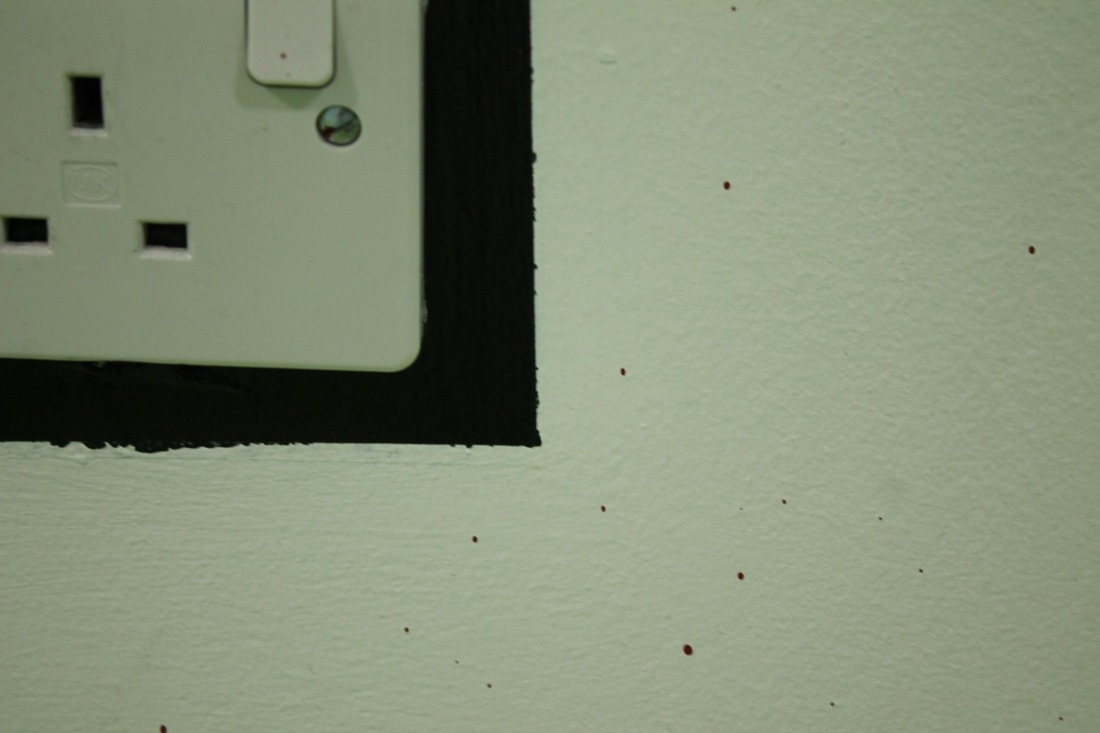
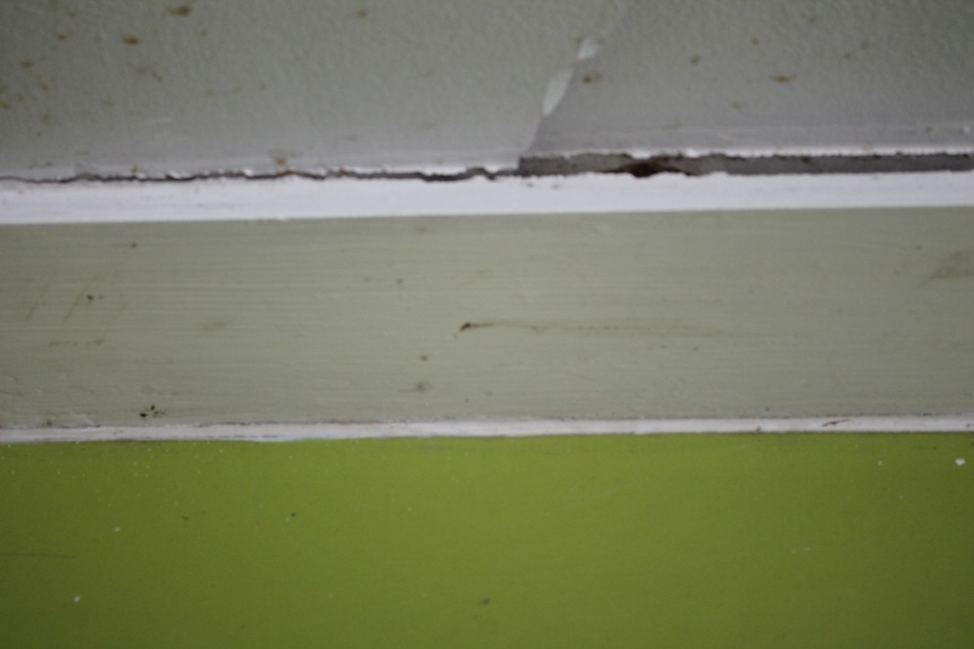
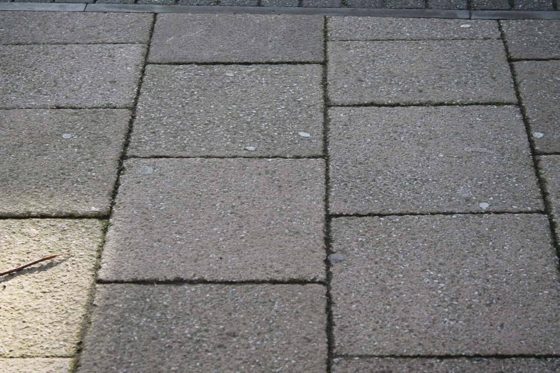
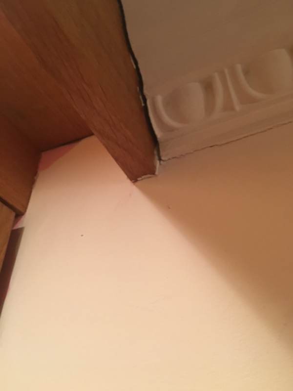
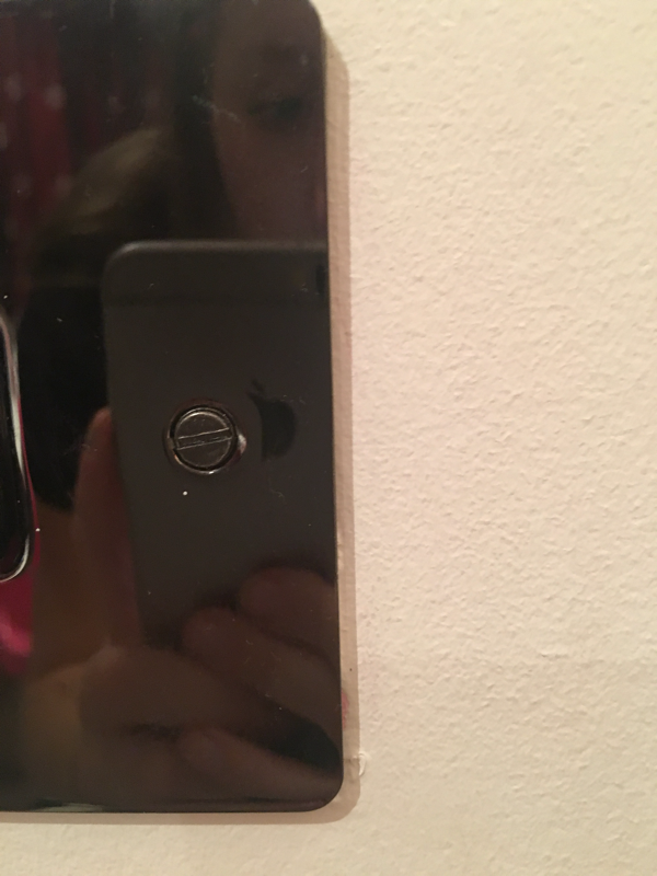
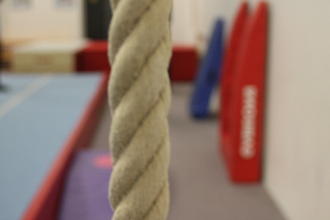
Currently we are learning about edges. So our homework was to take as many photos as possible. Also when you take a picture it becomes an edge, that happens with all the pictures.
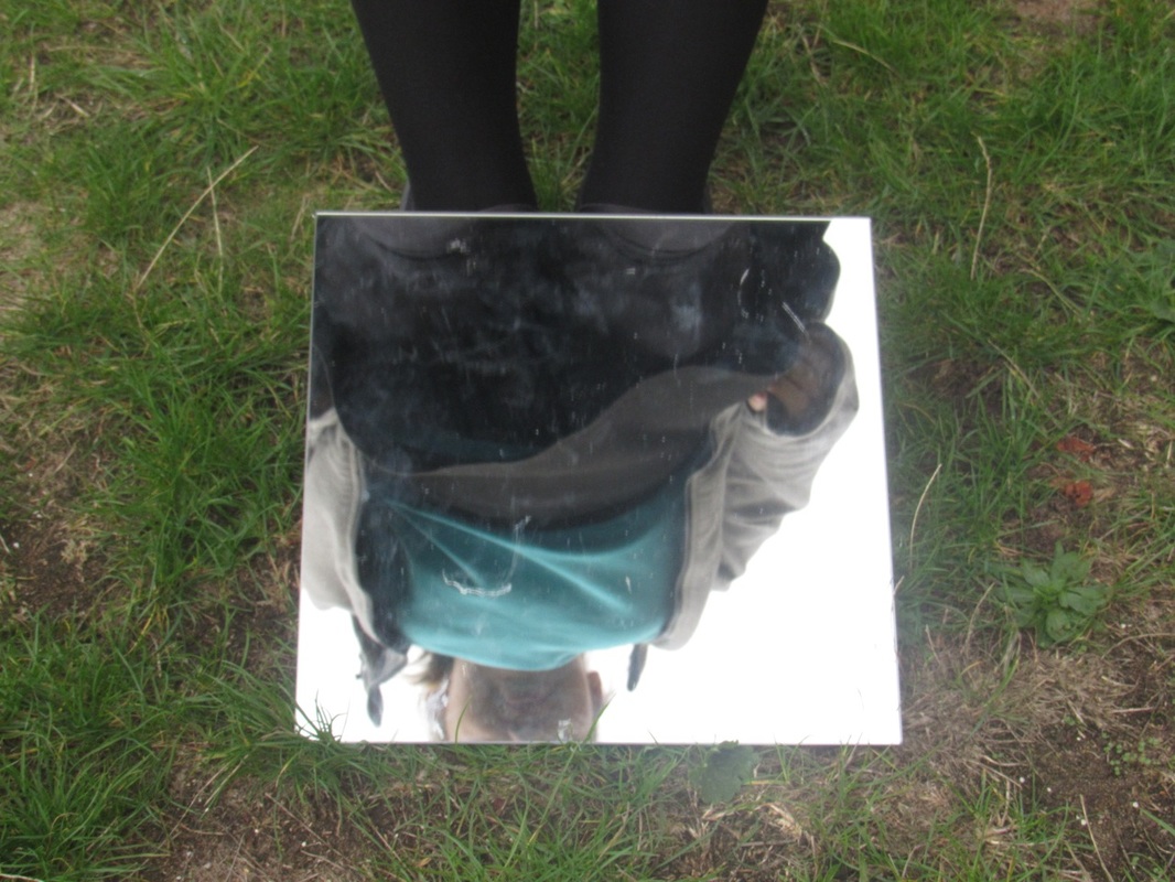
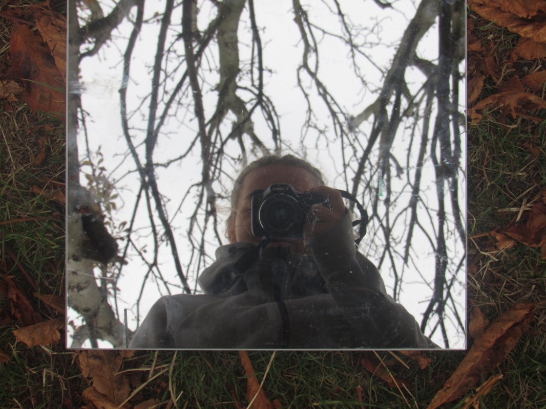
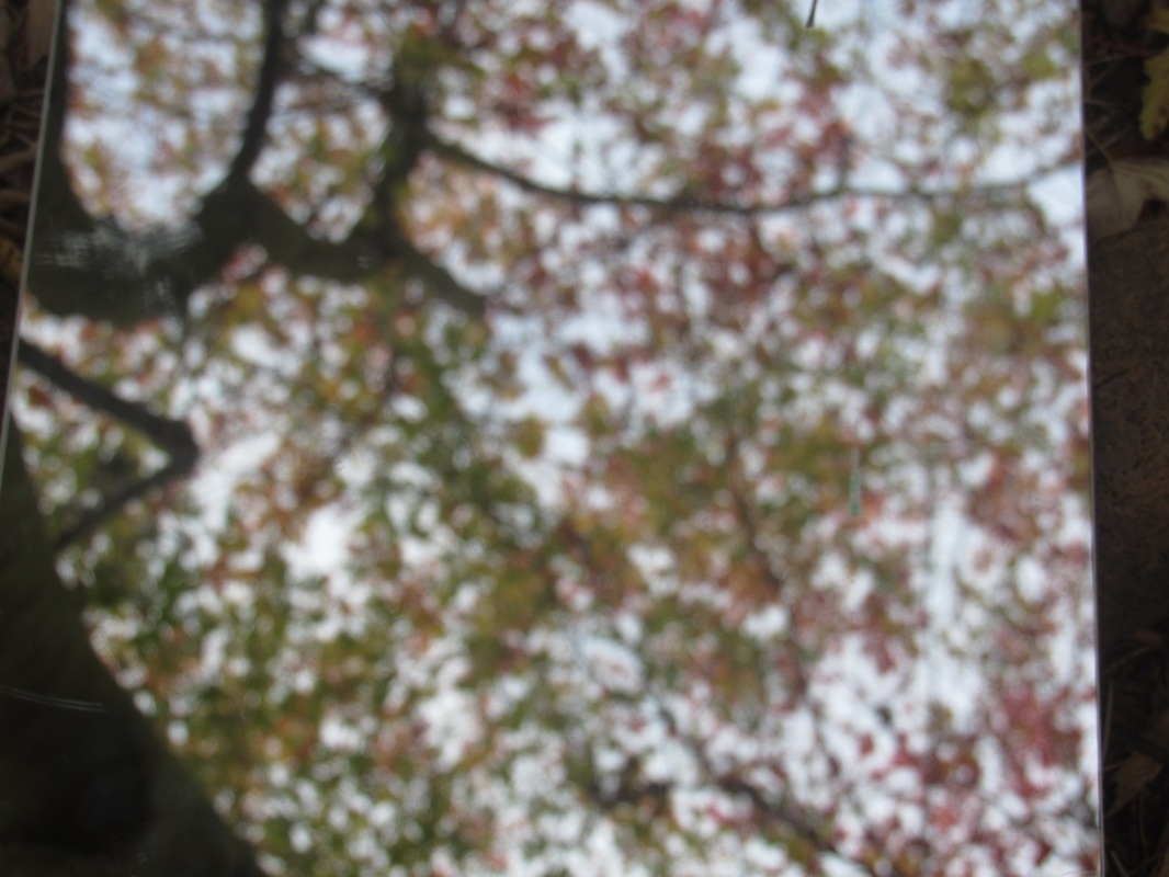
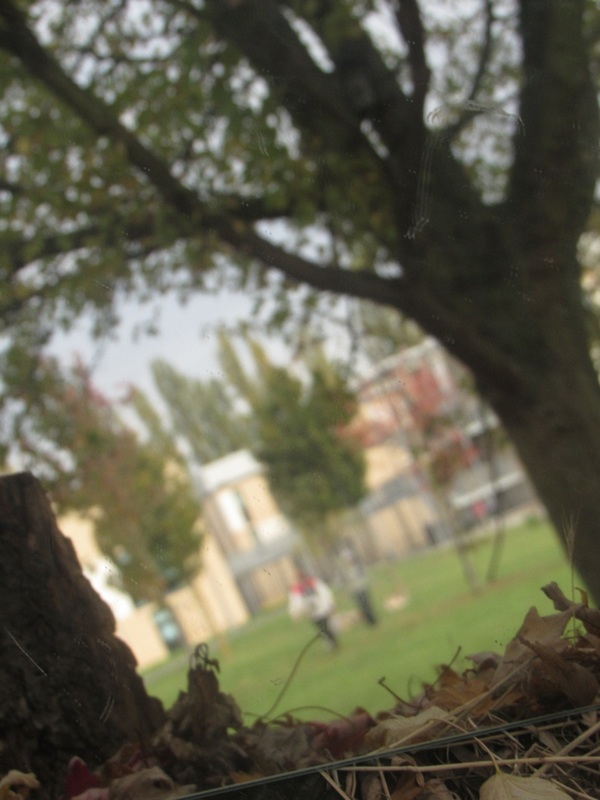
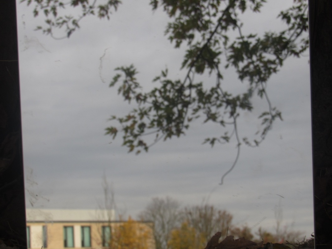
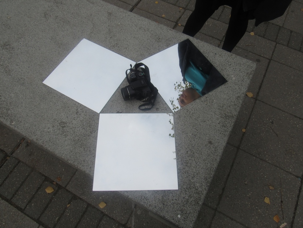
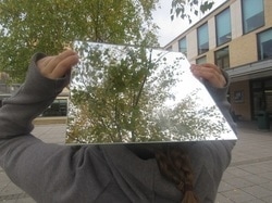
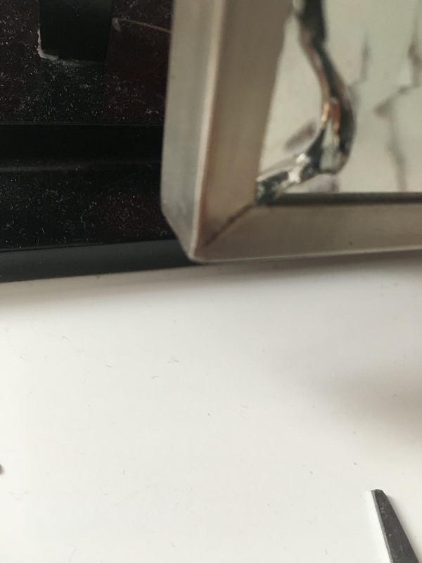
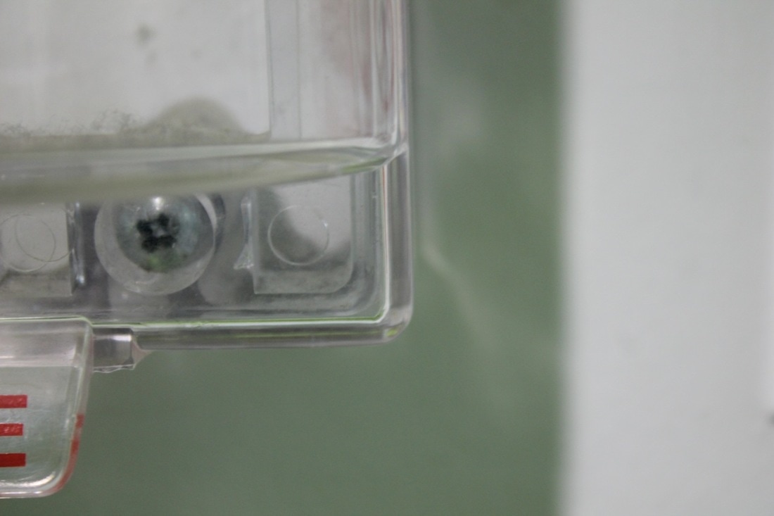
We had to use the mirrors and take some pictures with them to explore edges within edges. Before going out and taking pictures the whole class had a conversation about when we take a picture of something it flatteners and becomes a picture that had edges.
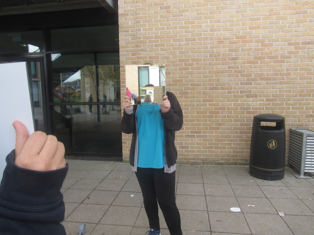
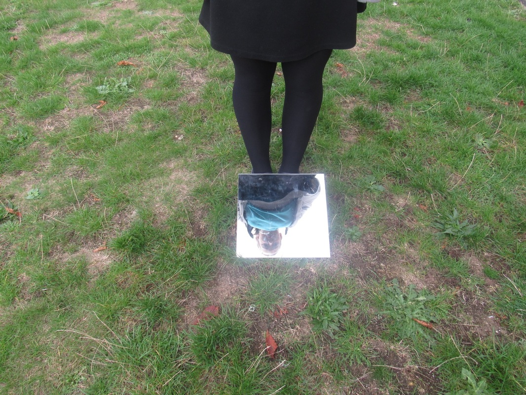
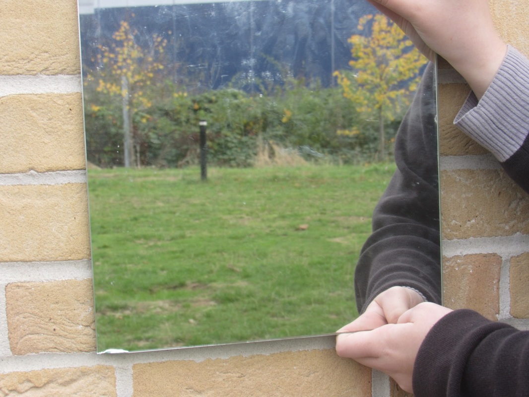
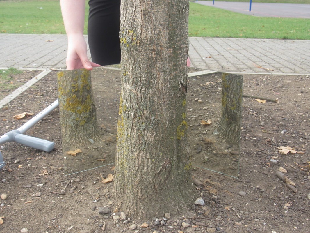
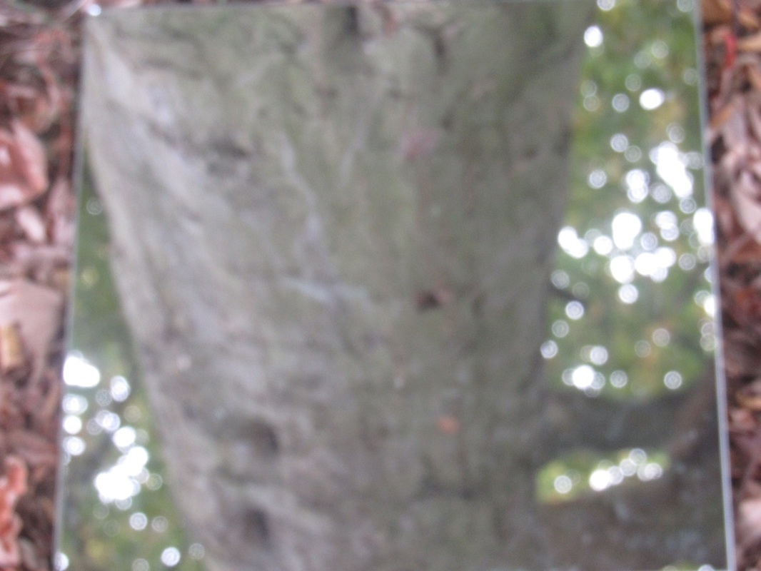
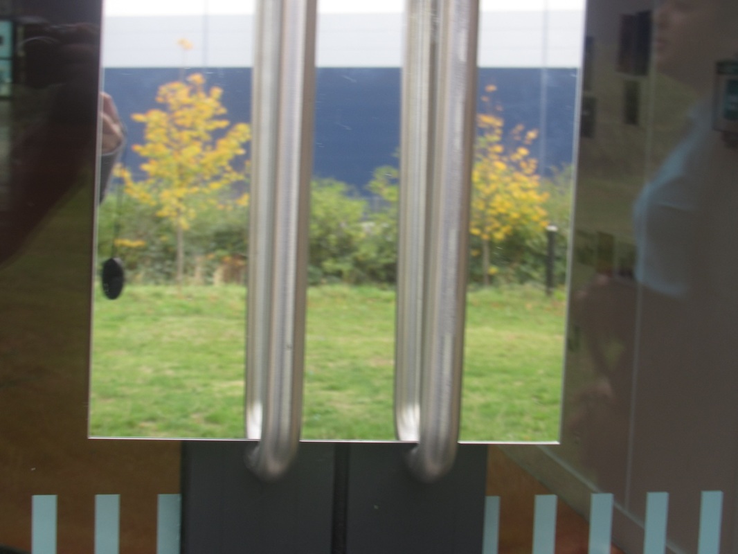
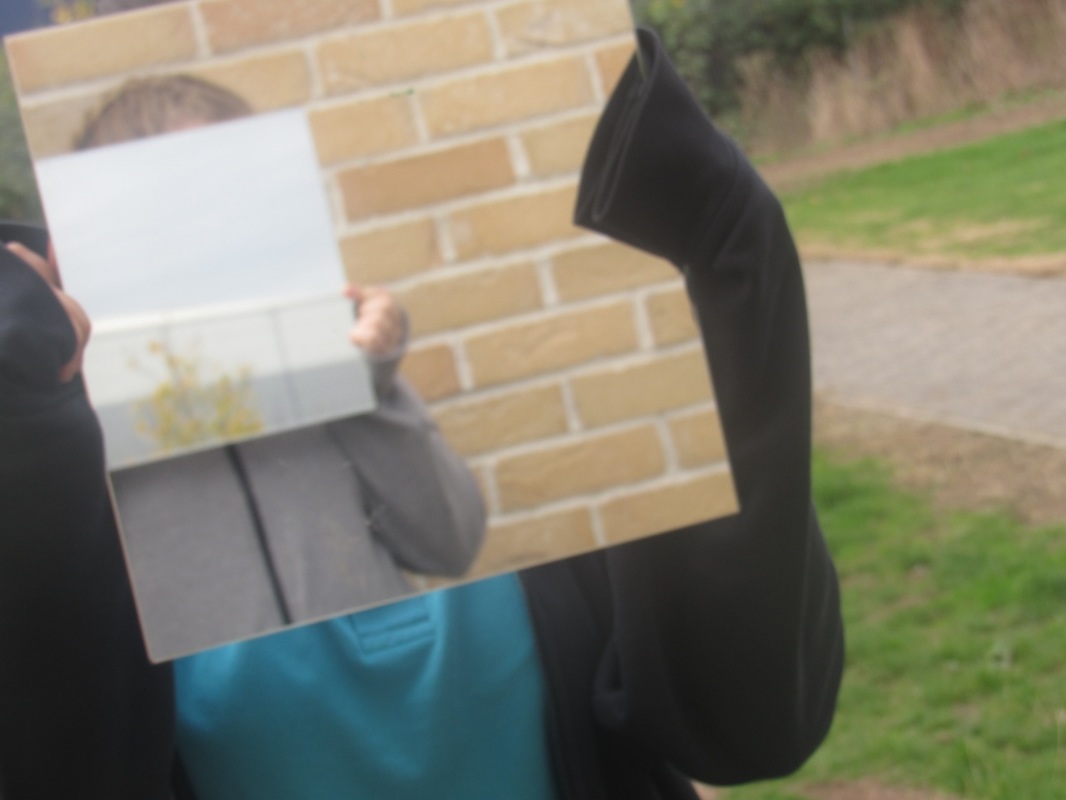

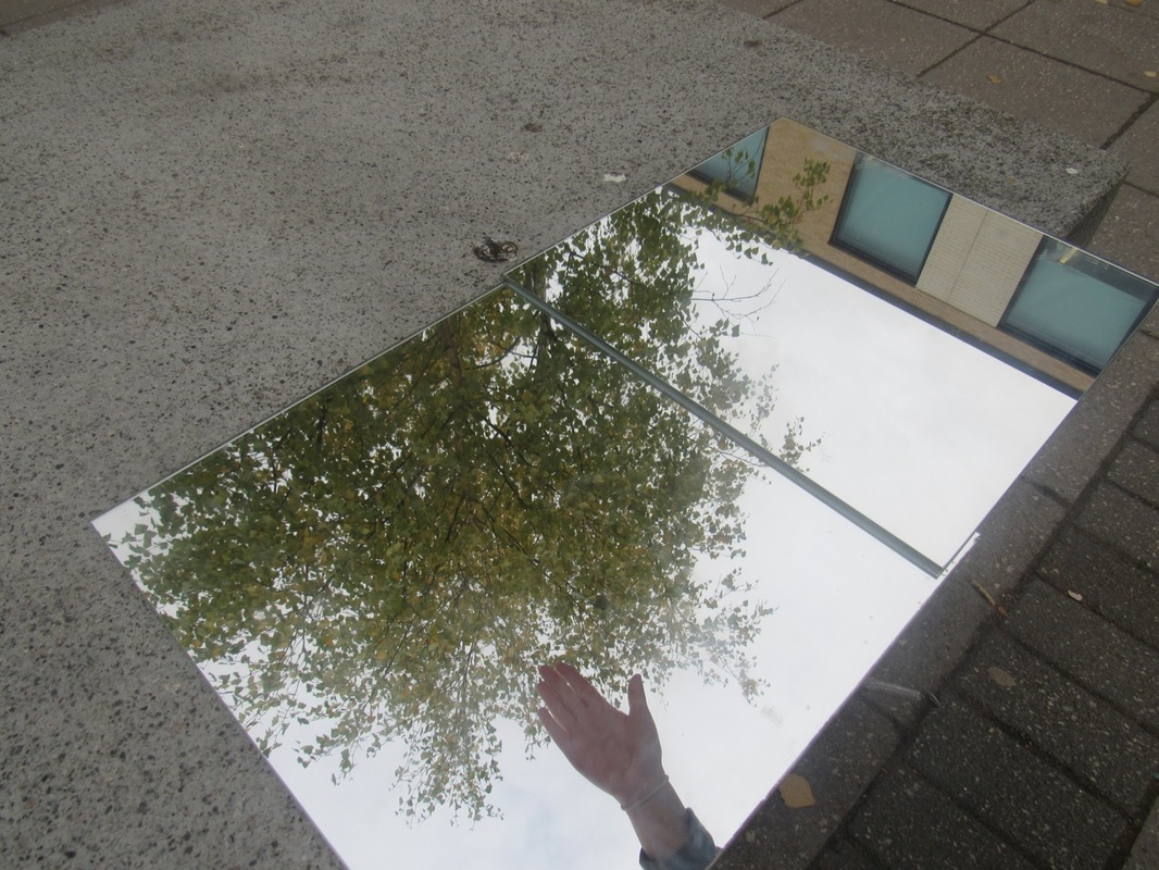
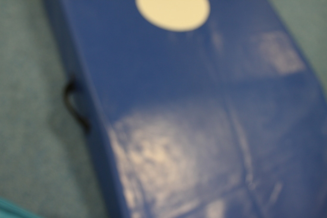
This photo came out really well because it wasn't blurry and the reflection on the mirror is really clean.
|

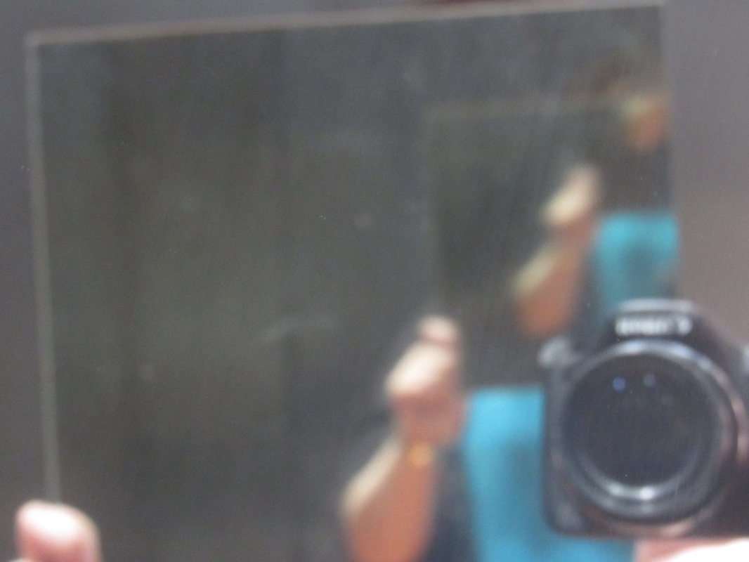
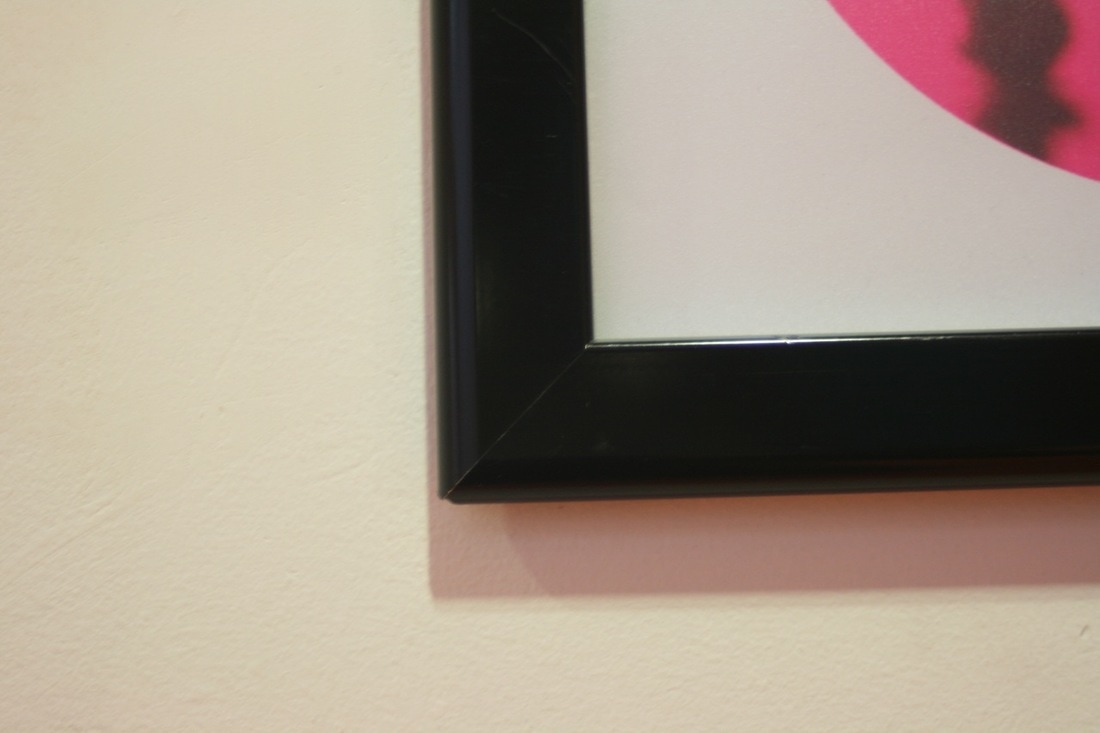
This photo didn't come out as well because the camera moved and it was fuzzy.
|
Abstract paper photoshoot
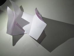
We were given one sheet of A4 paper and asked to fold it in any way we liked. We were then asked to photograph the sheet of paper in different lighting conditions, focusing on its edges. We did this in a light space which didn't really work out, so the next time we did this we went in the dark room which worked out better than the first time we did this.
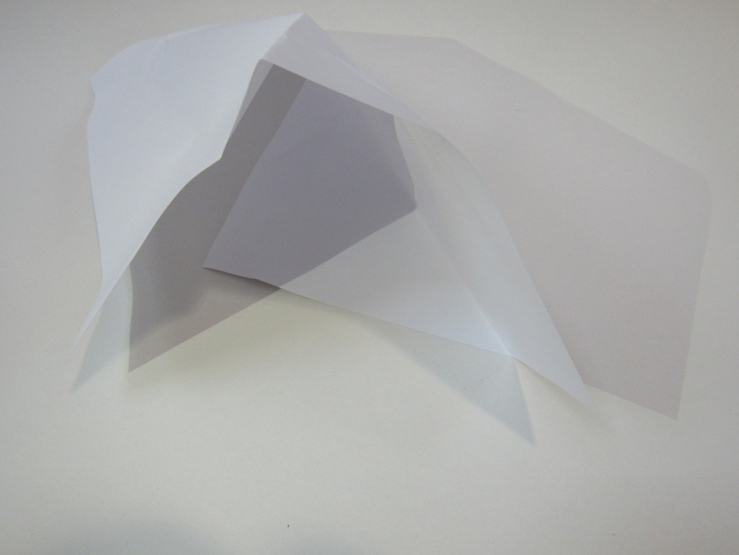
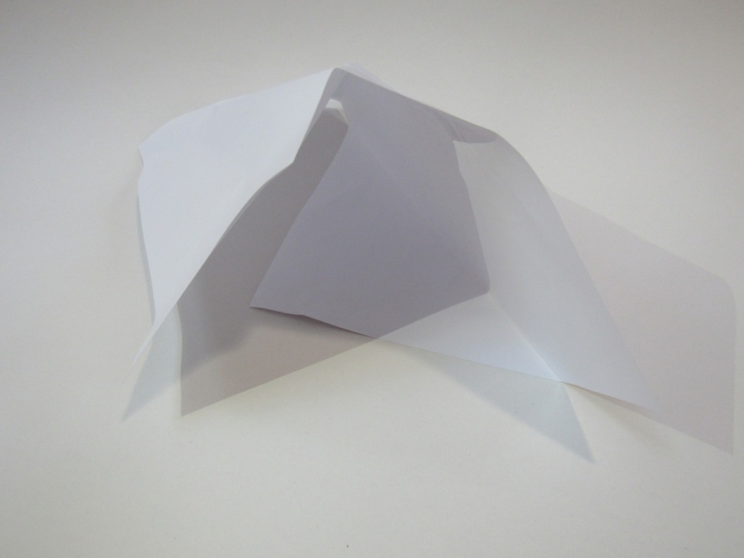
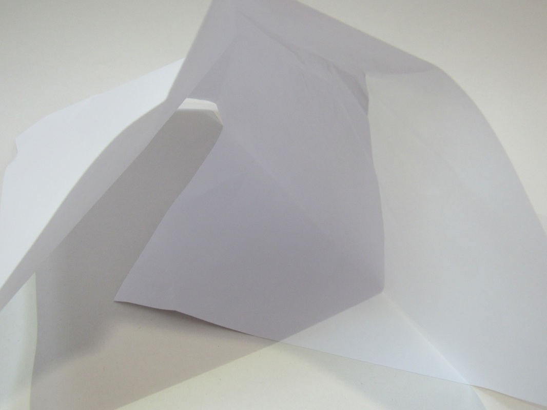
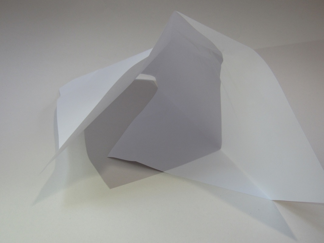
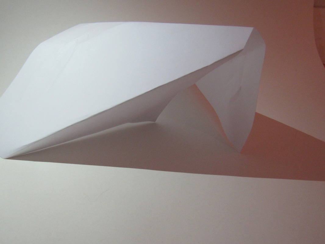
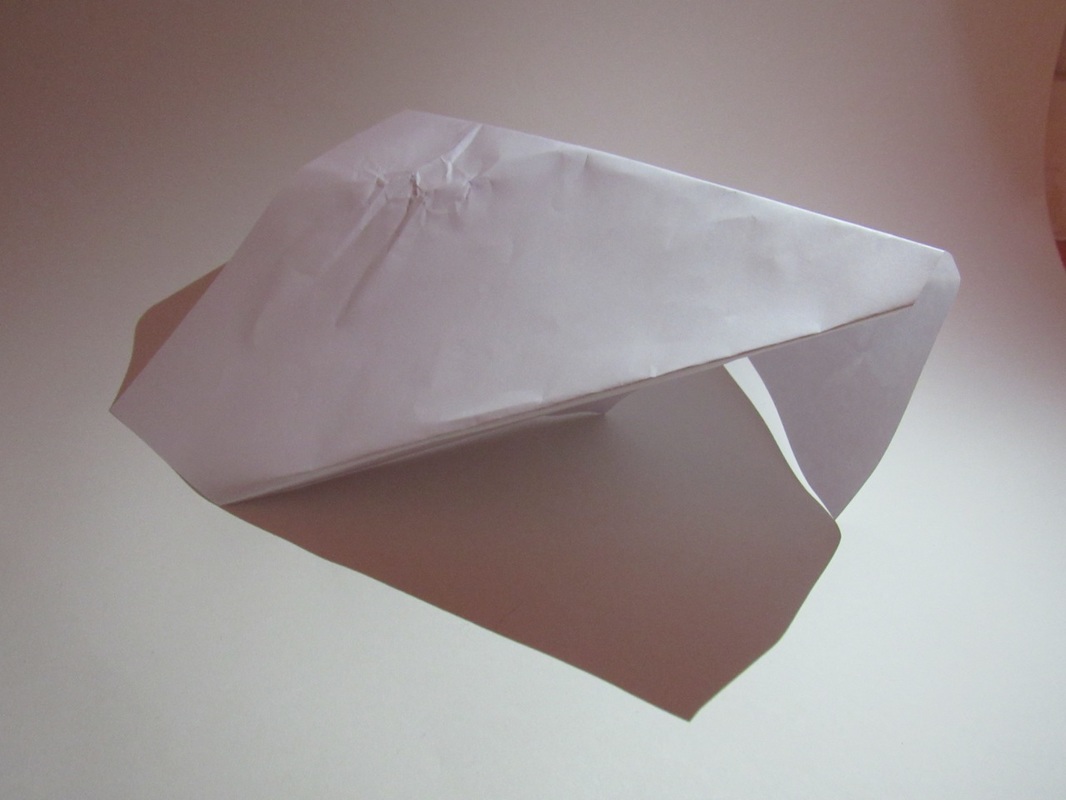
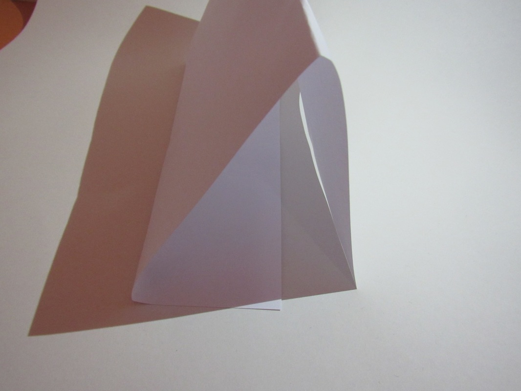


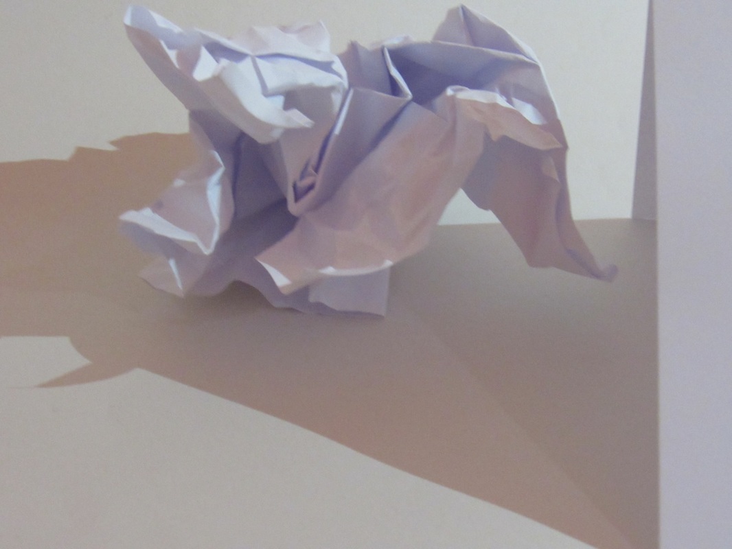
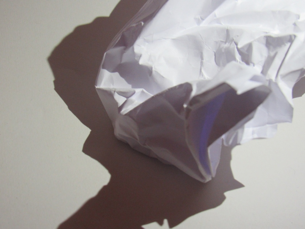
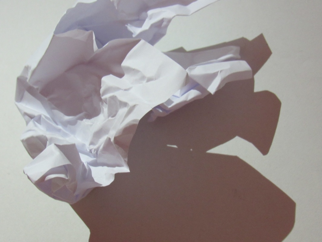
This is the one when we were in the dark room and you can probably tell that these photographs are much better than the other ones. We had to get 2 pieces of paper 1 of them was our backdrop and the other we had to make something out of it and shine light to get a shadow.
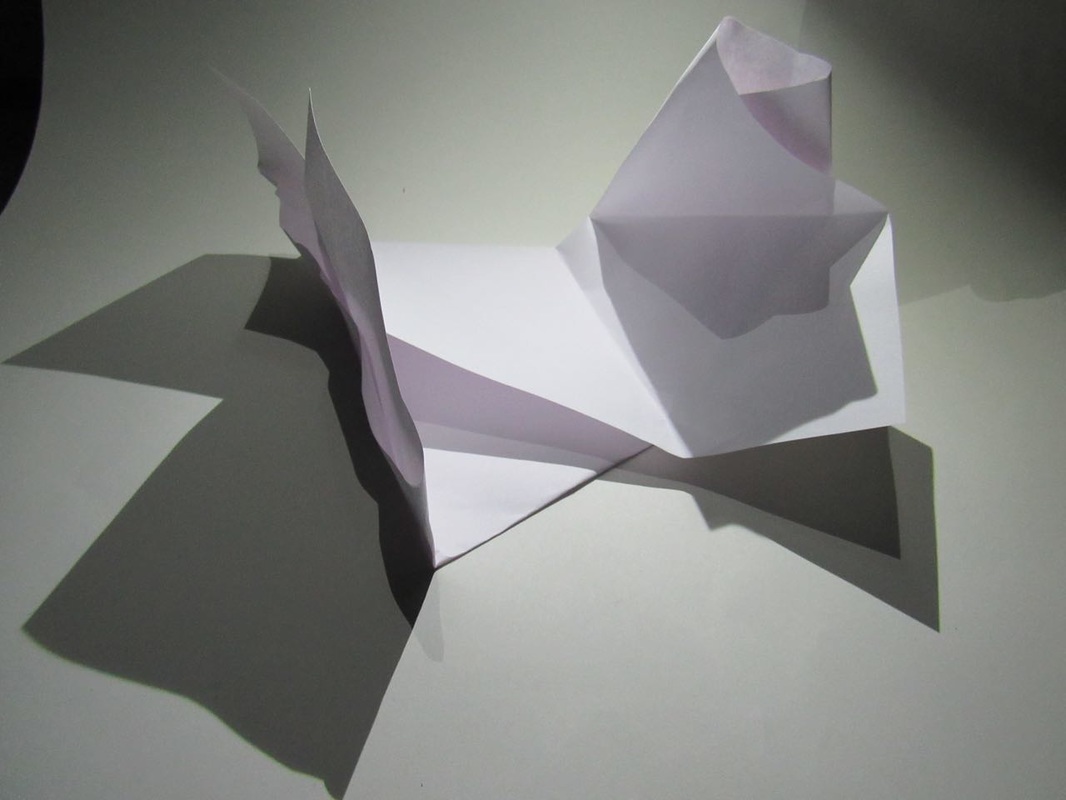
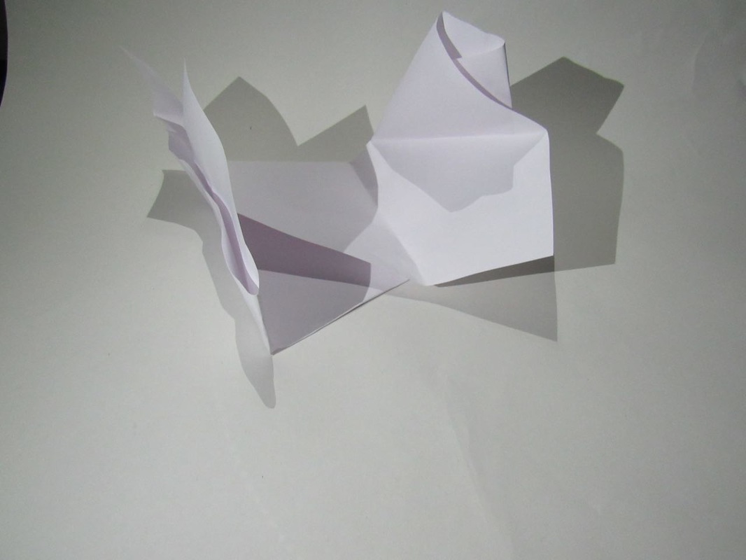
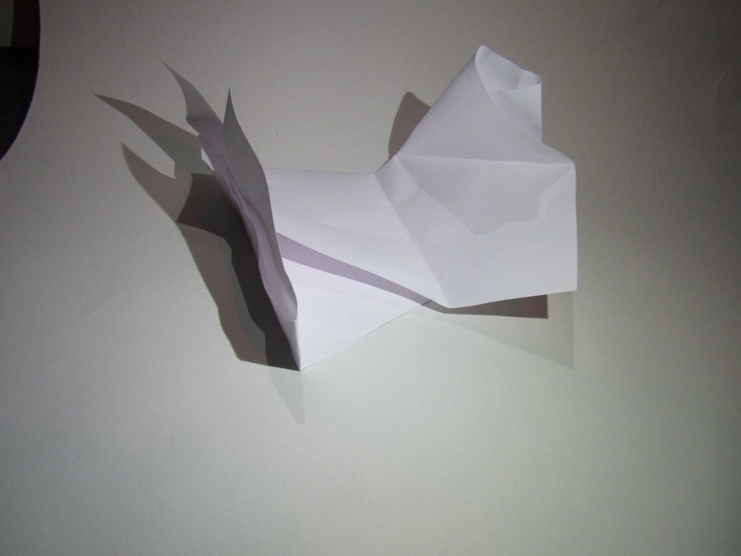
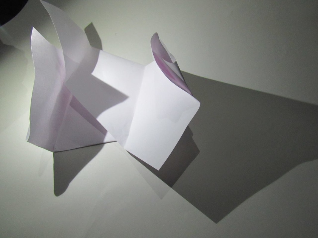
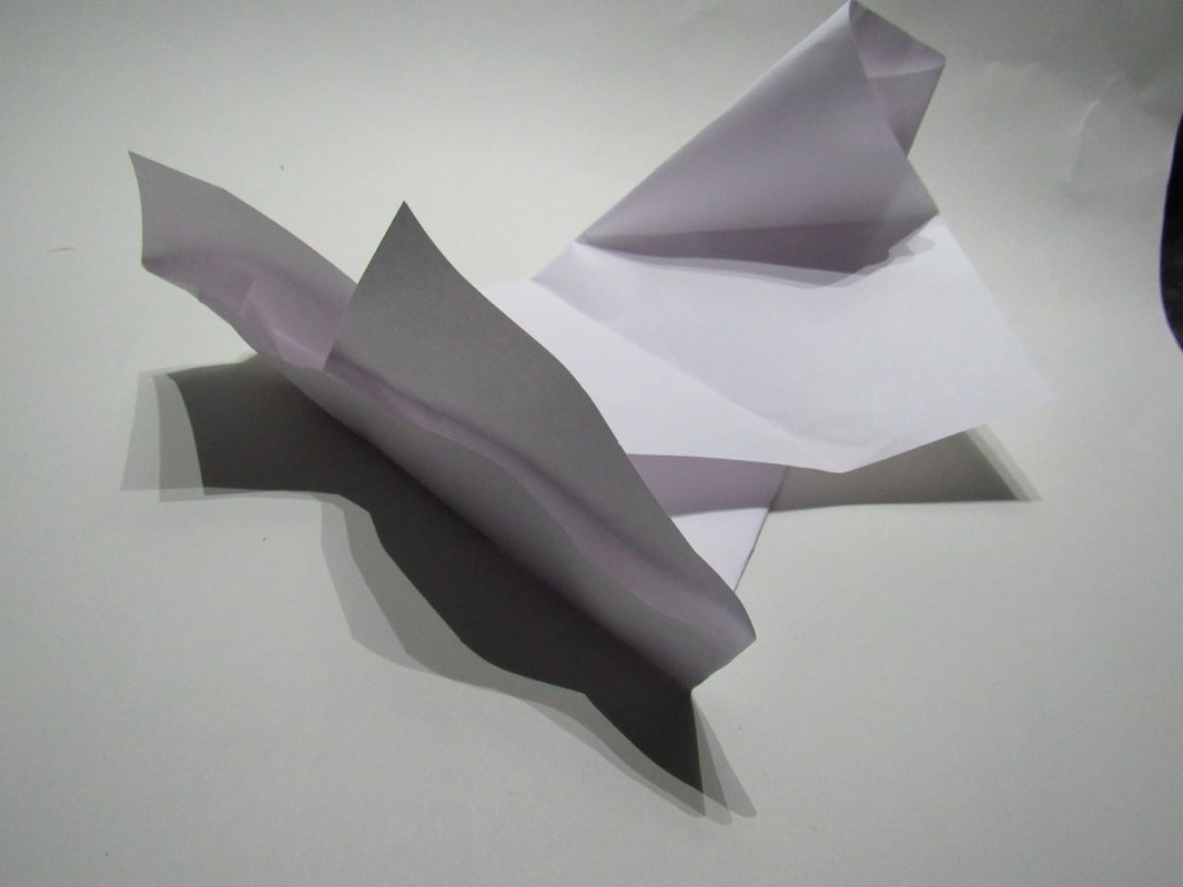
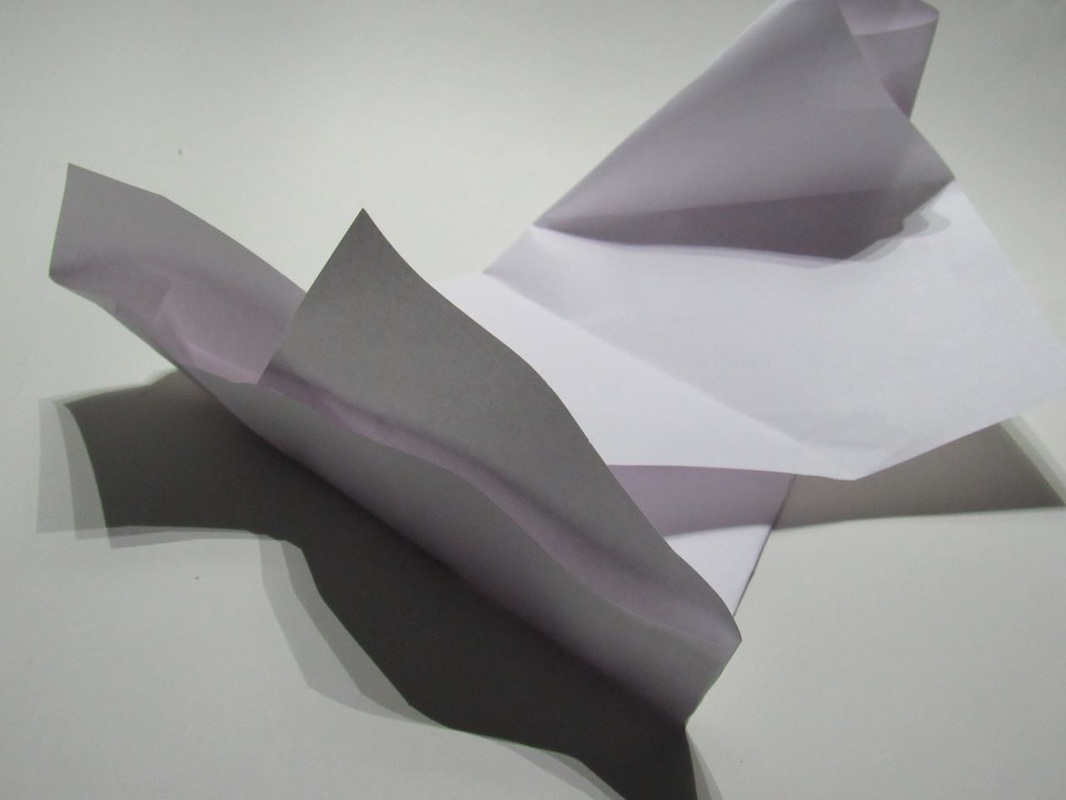

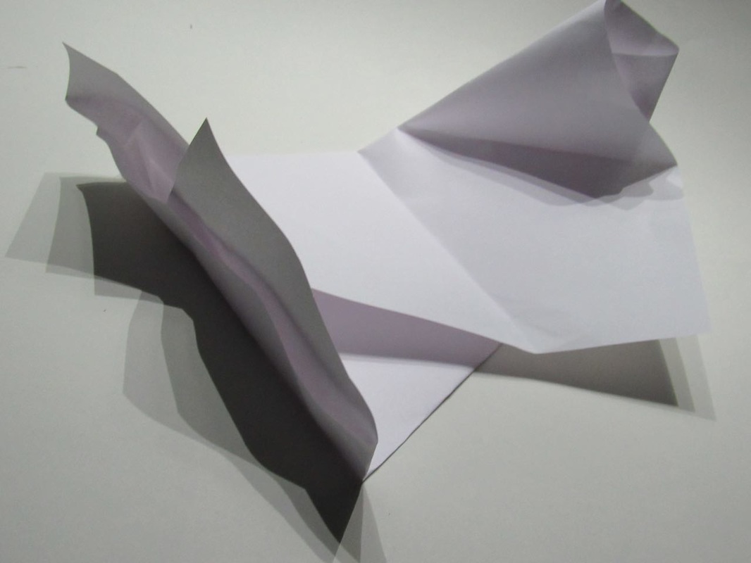
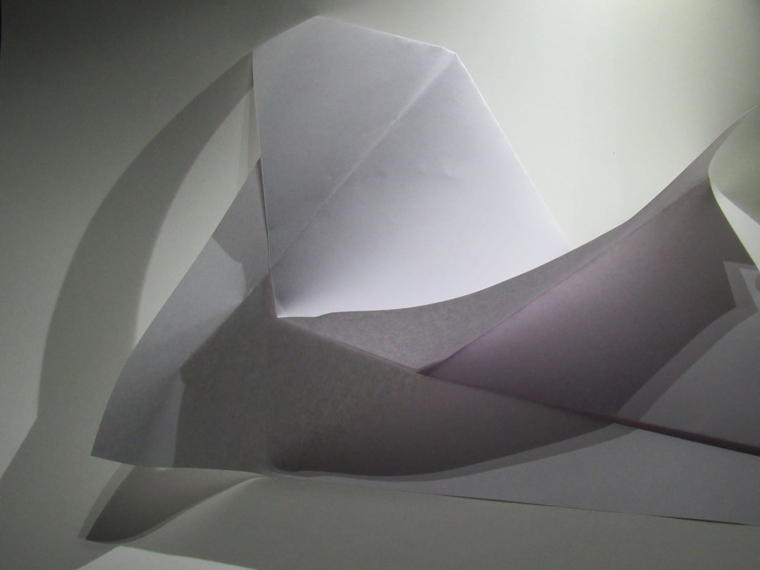
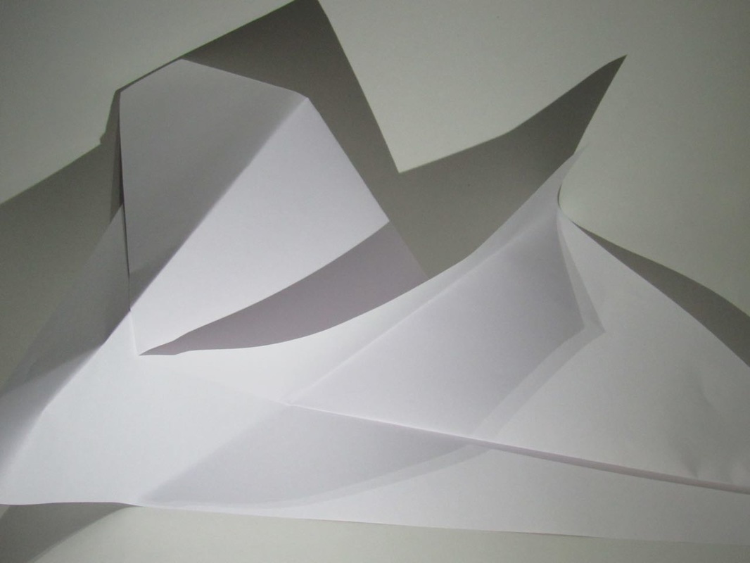

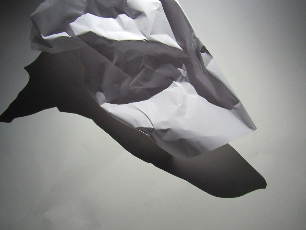
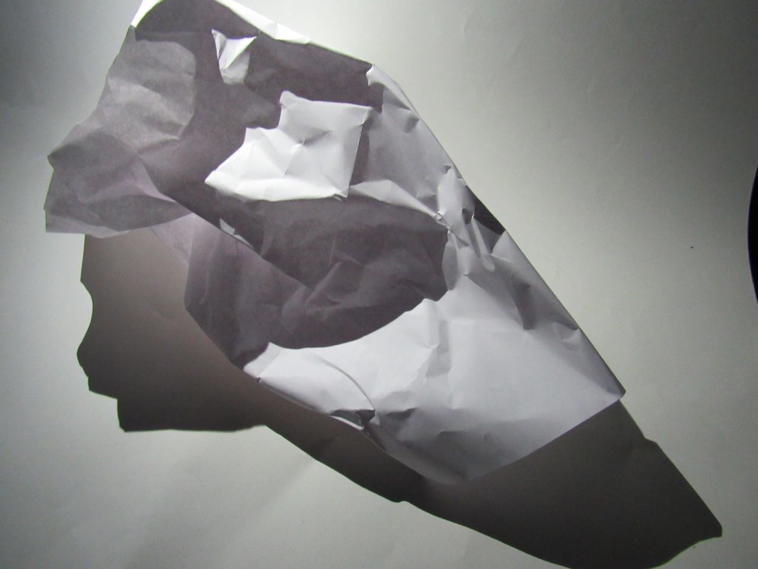
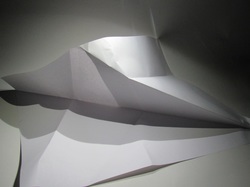
WWW: I have chosen this picture because i thought that it is the best. I think it was better than the other pictures we took thats because we were in the dark room which made the contrast between the light and dark better. Well heres a question to think about, how many pieces of paper? If you think that there is two well your wrong there is only one. This is one of the successful elements of my shoot.
|
EBI: We could of changed where we placed the light so the contrast could of been better and the shape of the paper could be better as well.
|
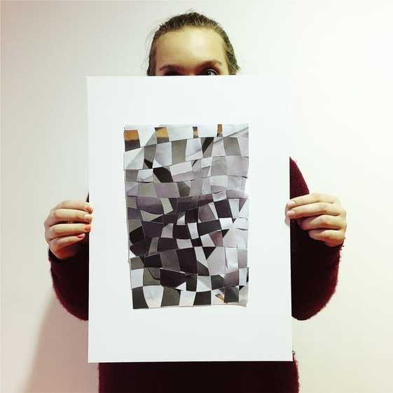
This is my final outcome.
My final outcome relates to the theme edges because I have chosen two pictures and cut them as waves and weave them, but to help me I numbered them in order. I created my image by choosing the most different pictures so they give an effect I did this because it was different and no one done this before.
I am proud of my work because it work which I didn't would. If I was to do this again I would aim to improve by sticking with out any spaces and it could be neater.
'Edges' Picture Comparison
On Friday 6th January we were given two sheets, one had questions and the other had pictures.
These are the sheets.
The differences between them are:
Robert's frank is more real.
This one is also in black and white whereas
the other one is colourful.
Different shapes.
One has writing.
The similarities between them are:
They both have some sort of edges in the photos.
They have both used composition.
Both have lines to break up the picture in bits.
Finally they both have shadows somewhere in the photo.
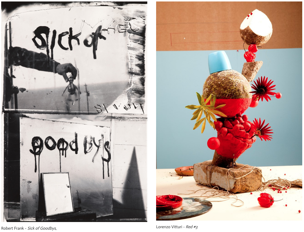
Robert Frank - SICK OF GOOD BYS, Mabou, 1978
This is a black and white picture. The top one has 'SICK OF' written on the picture. This picture is dark and gloomy. This top photo
might have a negative view. If you look closely at the top pictures you could see a man or a women holding something which looks like a body and a head which is quiet unusual. Also the writing looks like its dripping. If this photo had colour it might have a different effect of it, it might not be a negative view. Again on the top picture 'SICK OF' has engraving of 'MAEL' but its not that clear also it has engraving on the bottom picture which says 'STUOLL' I can't think of what that could mean. This is a portrait photograph made with two land- scape pictures.
Lorenzo Vitturi - Red #1, 2013
This picture is colourful. It has layers of different kinds of fruit. At the bottom there is a paint pallet, which could mean part of this picture is painted and some is real. This picture is also broken up into parts, to make that happen i think they used different coloured paper or painted the walls and blended that in so it looks really neat. Also the blue back-ground make the red pop out more which makes it effective. In this picture there are quite unusual for example they are using a brick like a plant pot and the fruit aren't the exact size of what they would normally be. However this picture makes you think twice because how can all of this balance? like i said before part of this could be paint but we will never know unless we meet the artist or ask someone that was there when this was made.
The main similarities are that they use the formal elements. The most ones that they use are line and shape. I think both artists really thought about what they were doing and if the lighting was good because these two pictures have a really good effect and personally I really like these two pictures. The most things that strike me the most interested is on the black and which one is the writing in it because I really want to know what it could mean. However on the 'Red' picture I want to find out that it is all balancing or if parts of it painted.
Both of these pictures have lots of edges especially the one in black and white because this one had lots of mirrors and shadows that have edges as well. Although the other picture doesn't have many edges it still has some. If I had a chance to meet the artists/ photographers I would like to ask Lorenzo if the photo was painted or it was real. I would I ask Robert what the 'sick of good bys' meant and why he put that on there.
If I could name these photographs I can't really think of one but maybe for the Lorenzo I could name it 'confused' because it is quite confusing and I'm not sure for the other one. If I was to be inside of these photographs I would be scared confused because I'm there not knowing what to expect. I think they might of wanted to put a message out to the world or to something or they just wanted to do it for a gallery but it can be for many more reasons.
These are the sheets.
The differences between them are:
Robert's frank is more real.
This one is also in black and white whereas
the other one is colourful.
Different shapes.
One has writing.
The similarities between them are:
They both have some sort of edges in the photos.
They have both used composition.
Both have lines to break up the picture in bits.
Finally they both have shadows somewhere in the photo.
Robert Frank - SICK OF GOOD BYS, Mabou, 1978
This is a black and white picture. The top one has 'SICK OF' written on the picture. This picture is dark and gloomy. This top photo
might have a negative view. If you look closely at the top pictures you could see a man or a women holding something which looks like a body and a head which is quiet unusual. Also the writing looks like its dripping. If this photo had colour it might have a different effect of it, it might not be a negative view. Again on the top picture 'SICK OF' has engraving of 'MAEL' but its not that clear also it has engraving on the bottom picture which says 'STUOLL' I can't think of what that could mean. This is a portrait photograph made with two land- scape pictures.
Lorenzo Vitturi - Red #1, 2013
This picture is colourful. It has layers of different kinds of fruit. At the bottom there is a paint pallet, which could mean part of this picture is painted and some is real. This picture is also broken up into parts, to make that happen i think they used different coloured paper or painted the walls and blended that in so it looks really neat. Also the blue back-ground make the red pop out more which makes it effective. In this picture there are quite unusual for example they are using a brick like a plant pot and the fruit aren't the exact size of what they would normally be. However this picture makes you think twice because how can all of this balance? like i said before part of this could be paint but we will never know unless we meet the artist or ask someone that was there when this was made.
The main similarities are that they use the formal elements. The most ones that they use are line and shape. I think both artists really thought about what they were doing and if the lighting was good because these two pictures have a really good effect and personally I really like these two pictures. The most things that strike me the most interested is on the black and which one is the writing in it because I really want to know what it could mean. However on the 'Red' picture I want to find out that it is all balancing or if parts of it painted.
Both of these pictures have lots of edges especially the one in black and white because this one had lots of mirrors and shadows that have edges as well. Although the other picture doesn't have many edges it still has some. If I had a chance to meet the artists/ photographers I would like to ask Lorenzo if the photo was painted or it was real. I would I ask Robert what the 'sick of good bys' meant and why he put that on there.
If I could name these photographs I can't really think of one but maybe for the Lorenzo I could name it 'confused' because it is quite confusing and I'm not sure for the other one. If I was to be inside of these photographs I would be scared confused because I'm there not knowing what to expect. I think they might of wanted to put a message out to the world or to something or they just wanted to do it for a gallery but it can be for many more reasons.
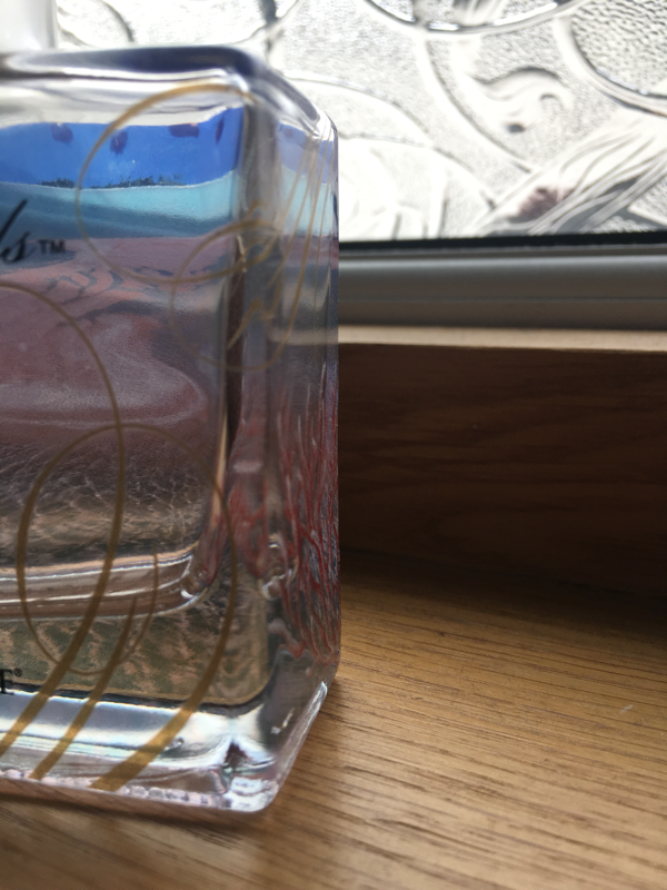
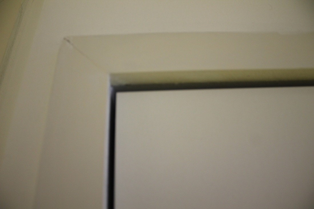
Photo shoot
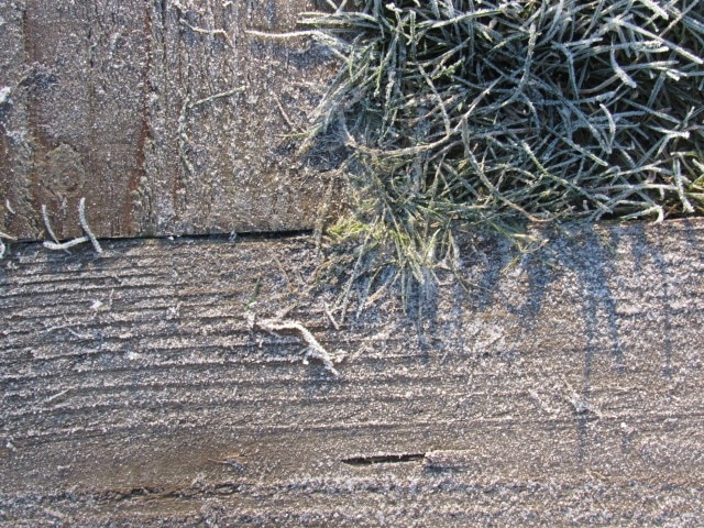
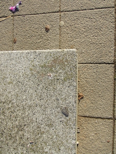
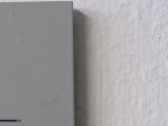
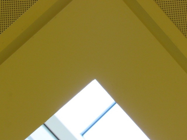
Here are the photos that I have taken on edges. We couldn't take as many because the camera wasn't working well.
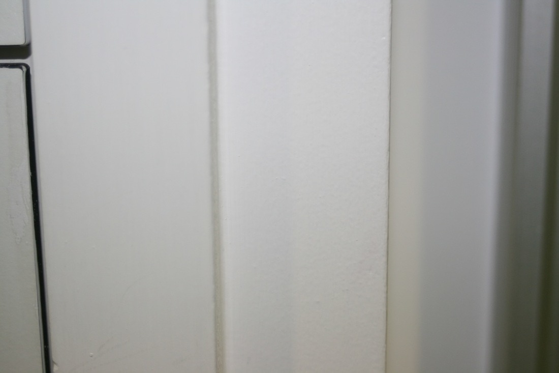
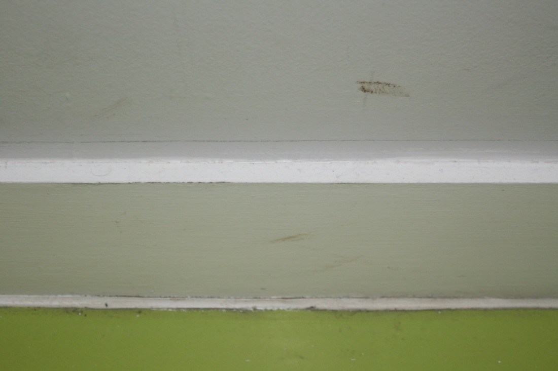
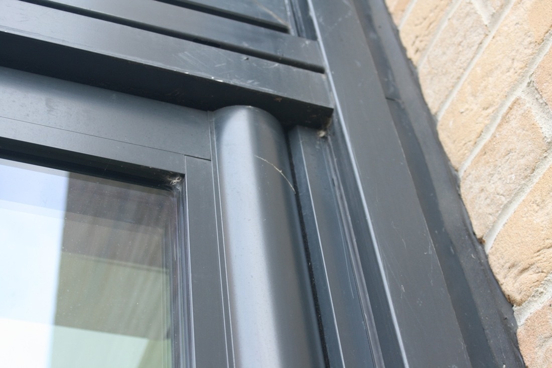
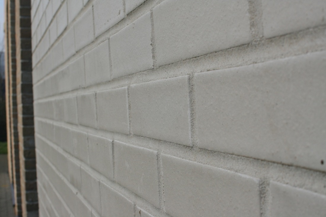
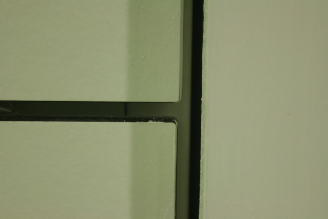
My homework photos. We had to take at least 30 pictures of edges so here is mine.
Photo shoot
Research
I picked these images because they are not the same to other artists also I chose a theme like the blue waters. There are different types of edges for example the second one with the mountains that has edges.
More information about Randy Grskovic. He made these images by finding photographs and cuts them into geometric abstractions.
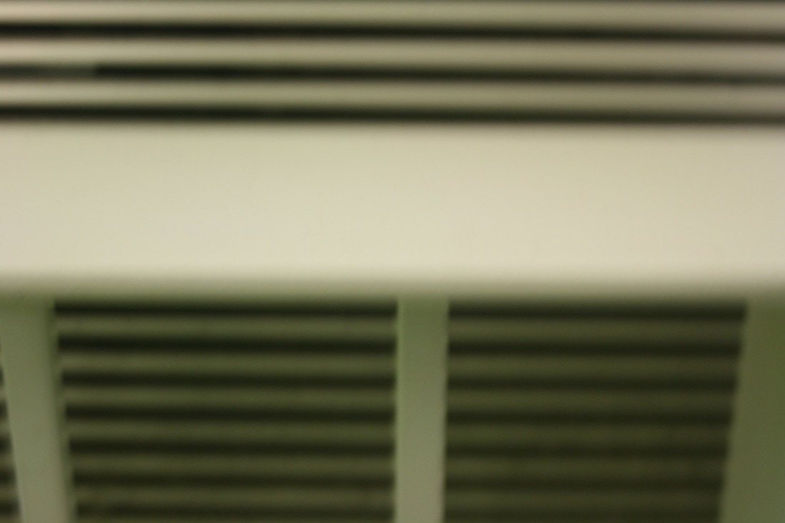
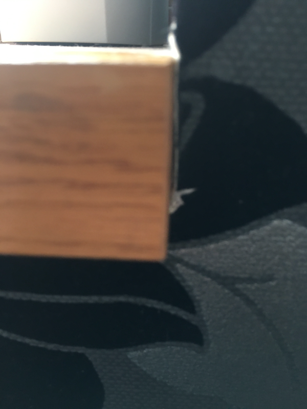
Assessment pictures. We had to select one or two photographs. Then re-photograph my chosen photographs and then we ha to take them in a variety of different locations.
These are the pictures that I took some came out well some didn't.
WWW: Good focus for some.
EBI: I could of experimented on more locations.
WWW: Good focus for some.
EBI: I could of experimented on more locations.
Extended Enquiry
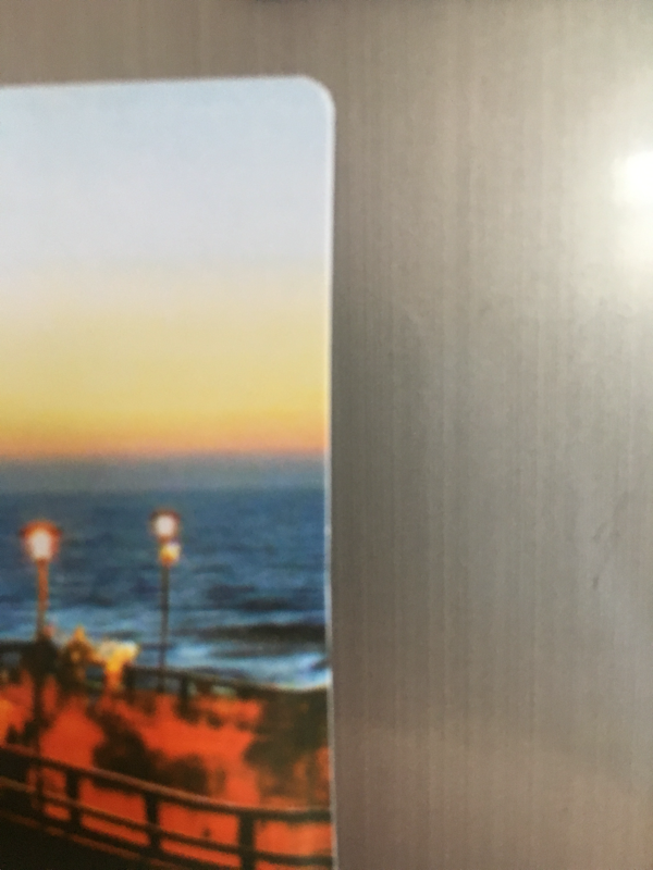
We were asked to create an exhibition of our own images in an unusual location, inviting an audience to see it. I decided to take pictures of edges in my home and exhibit them in the kitchen.
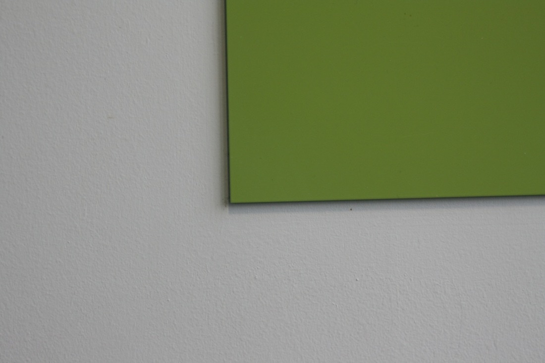
Photo shoot

Photographs of my exhibition
I placed the pictures on my fridge and invited my family to see them. I liked the exhibition. It was interesting to see photographs displayed in an unusual place and my family enjoyed seeing my work at home.
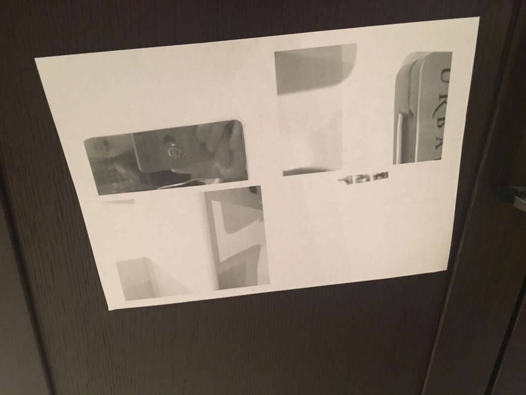
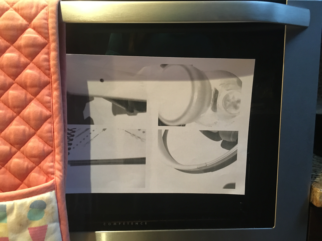
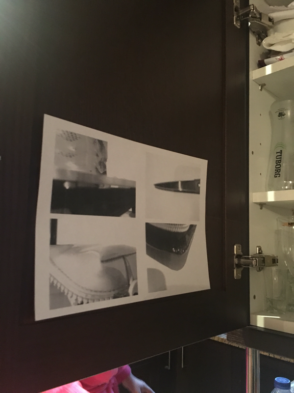
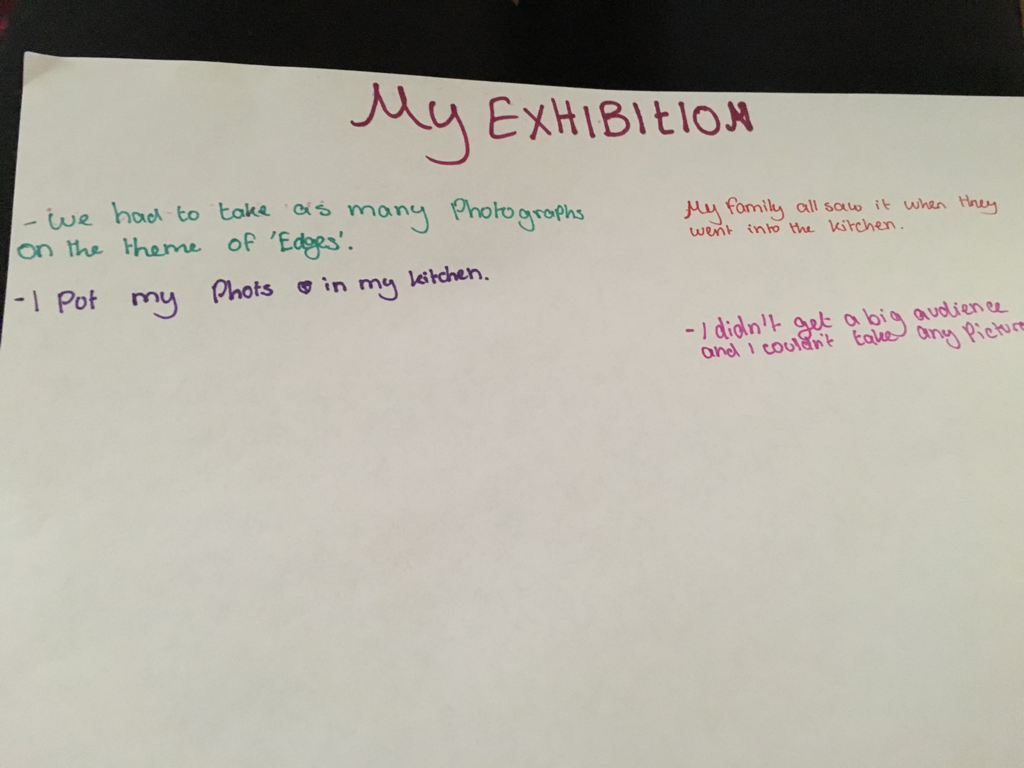
Photo shoot
Final outcome
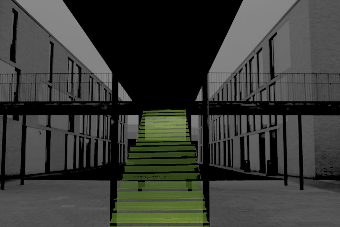
This is what I have done this lesson and is my second final outcome. I partnered up with one of the students in my class and we went out and took some photos and choose the best one that we can edit we also went into different blocks and took pictures of the different coloured stairs and added that to the final picture. So we choose this one and put it in photoshop and edited it to make it look like there are stairs in the middle. We thought to do it black and white so the stairs would stand out because they are green even though we faded them a little. But that is my final outcome.